Analytics Chart in API Manager
API Analytics provides a summary in chart form of requests, top apps, and latency for 1 hour, 3 hours, 1 day, 7 days, 1 month, 3 months, or 1 year. To view the Analytics chart, in API Manager, click the version name of a deployed API.
Requests Summary Chart
The requests summary chart lists the total number of requests to your API by the duration you choose. The chart shows the HTTP status codes specified by W3C. For example:
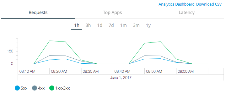
Graph lines are provided for:
-
Green - Successful requests that returned a status code from 1xx to 3xx.
-
Dark Gray - Client failed requests that returned a status code of 4xx.
-
Blue - Server failed requests that returned a status code of 5xx.
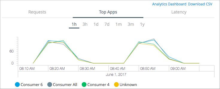
Top Apps Summary Chart
The top apps summary chart lists the number of requests made to the API by each application for the top 5 applications calling that API. Each color represents one of the top 5 applications accessing the API. The y-axis plots the number of calls made to the API.
The graph lists the number of requests over the duration you select, for example:
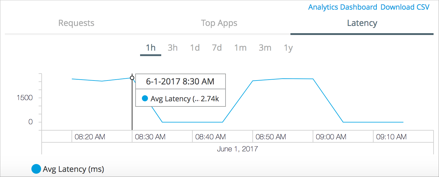
Latency Summary Chart
The latency summary chart lists the average API latency for the period selected. The higher the latency, the lower the performance. The y-axis in the chart lists the average latency in milliseconds (ms).
The following example shows that worst average performance during the hour occurred at 8:30 am.