API Experience Hub Lightning Components
You can design the pages of your API Experience Hub portal by adding and configuring Lightning components in the Builder.
These Lightning components include both the Lightning components available in all Salesforce Digital Experiences and the API Experience Hub Lightning components available only in API Experience Hub.
Each API Experience Hub Lightning component has different configuration options and adds different functionality to the portal.
Many API Experience Hub Lightning components show data from Anypoint Platform. Portal admins can change some of these data fields, such as API names, descriptions, and icons. API Experience Hub saves these changes but does not push the changes back to Anypoint Platform.
To add API Experience Hub components:
-
Click the Components lightning bolt icon to display the component palette.
-
Drag any component from the component palette to the current page.
-
Select the component on the page to show the component’s configuration options.
-
Edit the values by entering or selecting values in the component property fields.
To delete a component, click the delete icon and click Delete in the dialog.
API Console
The interactive API Console component shows information about your APIs and their methods. Endpoints are displayed in alphabetical order.
Console components include API Console, API Console Documentation, API Console Instances, API Console Specification, and API Console Request Panel. In the Builder, you can add multiple console components to the same page. Changes to a console component are visible in all other console components on that page that display the same API. For example, selecting the Summary tab in an API Console results in Summary tab selection in all API Consoles on the same page that display the same API.
The component shows the public API instances and documentation from Anypoint Exchange.
Select the following property to show in the API Console:
-
Expand endpoints
Asset Detail Header
The Asset Details Header component displays the API header, including icon, name, contact email, and description.
The API icon, name, and description shown are set in the API Experience Hub control panel when you add an API version to your community. The contact email is set in Anypoint Exchange.
Enter or select the following properties to show in the API details page:
-
Record ID
-
Show API Contact
-
Show API Clients
-
Show instance URL
-
Show categories
-
Show tags
-
Show Request access button
-
Show Download spec button
-
Show lifecycle state
Version State
Shows the API version lifecycle state.
-
Asset Documentation Viewer
The API Documentation Viewer component shows an API’s documentation from Anypoint Exchange. The documentation can have multiple pages, and each page can have multiple sections.
Assets Carousel
The API Carousel component shows a horizontally scrollable set of API cards that displays on the Home page. Each card shows an API.
You can specify values for the following Assets Carousel properties:
-
Title
Title of the carousel.
-
Subtitle
A subtitle that displays after the title of the carousel.
-
Cards to display
The number of API cards to display in the carousel. The carousel can display a minimum of three cards and a maximum of fifteen cards. If the number of cards to display is five and the portal has only three APIs, then the carousel displays three cards instead of five.
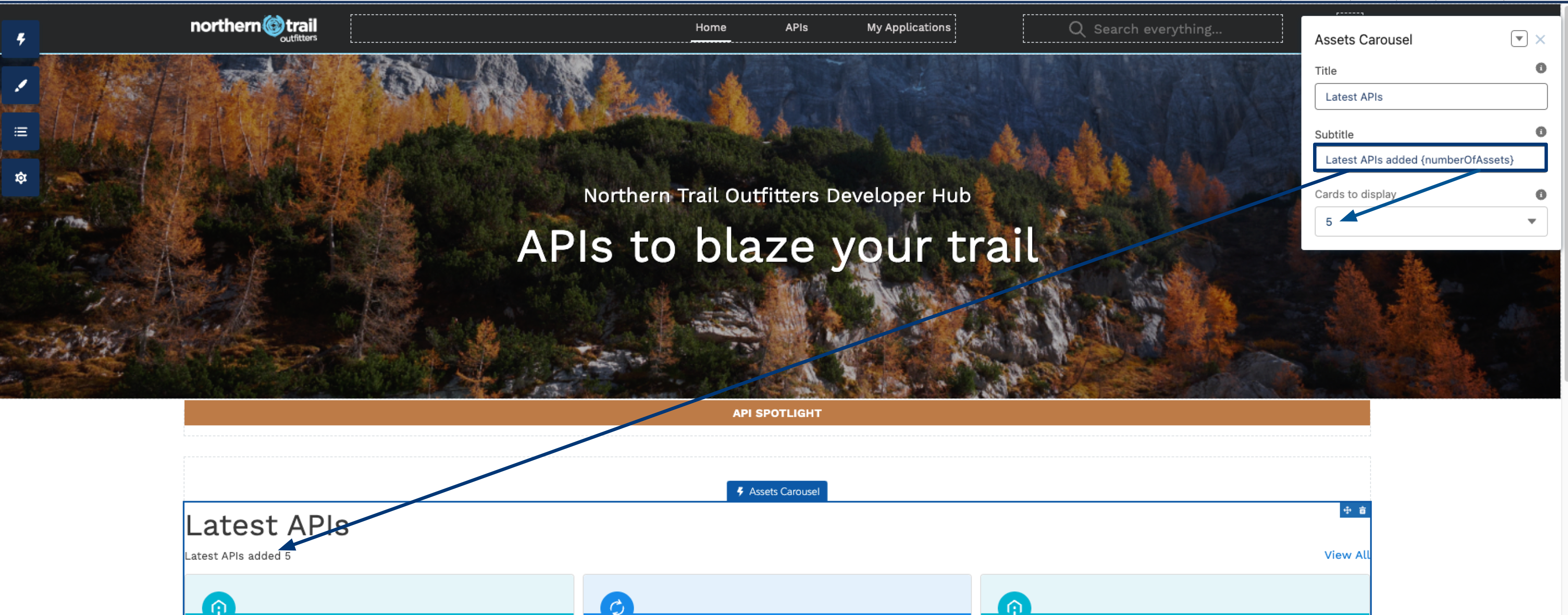
Change the Titles in the API Carousel
You can modify the title and subtitle that appear in the API Carousel. You can also show the number of cards in the subtitle by entering the {numberOfAssets} variable in the Subtitle field. For example, Latest APIs added {numberOfAssets}. The following image shows the subtitle as Latest APIs added 5 because the variable displays the number selected in the Cards to display field.
-
On the Manage your API portal page, click Preview and publish your portal.
-
On the Home page, click the Asset Carousel area to edit the Assets Carousel component.
-
Complete the fields and include any necessary information.
-
Click the Preview button to review your changes.
-
Click the Publish button to publish your changes.
Change the Number of Cards to Display in the API Carousel
To change the number of API cards that display in the API Carousel:
-
On the Manage your API portal page, click Preview and publish your portal.
-
On the Home page, click the Asset Carousel area to edit the Assets Carousel component.
-
In the Cards to display field, select a number from three to fifteen from the list.
-
Click the Preview button to confirm your changes.
-
Click the Publish button to publish your changes.
Assets Catalog
The API Catalog component offers API consumers an interactive way to explore all the available APIs in an API portal. The API Catalog shows API cards in rows and columns, divided into pages, and shows controls to search the displayed APIs by categories and search terms. Each card shows an API. With the catalog, users can view and explore large numbers of API versions.
Search Box
The API Experience Hub Search Box component enables users to search for both content that exists in Salesforce Experience Cloud (such as knowledge articles, support cases, and announcements) and content that exists in Anypoint Platform (such as APIs and client applications). Knowledge article, support cases, and announcements are currently not available.
Search Results
The API Experience Hub Search Results component shows results after a user enters a search in the Search Box component.