Touring Monitoring Dashboards
Built-in dashboards contain a standard set of graphs, while custom dashboards can display additional data that is important to your organization.
Both types of dashboards provide many of the same display options.
Setting Data Display Options in a Dashboard
You can display the data points collected for the last given period of time (such as the last 5 or 30 minutes) or over a given date and time range. Depending on your subscription, you might also be able to auto-refresh the displayed data.
Setting the Time Period to Display
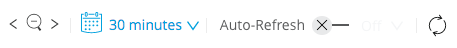
You can use the drop-down in the calendar icon to select the time period to display in a graph.
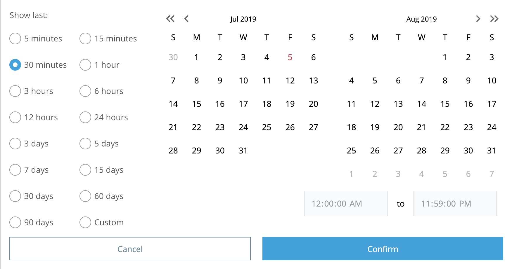
This configuration is for displaying data from the last given period of time in a graph:
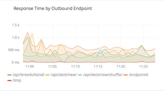
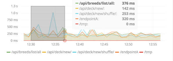
Your setting applies across all graphs in the dashboard. A graph in the dashboard might look something like this:
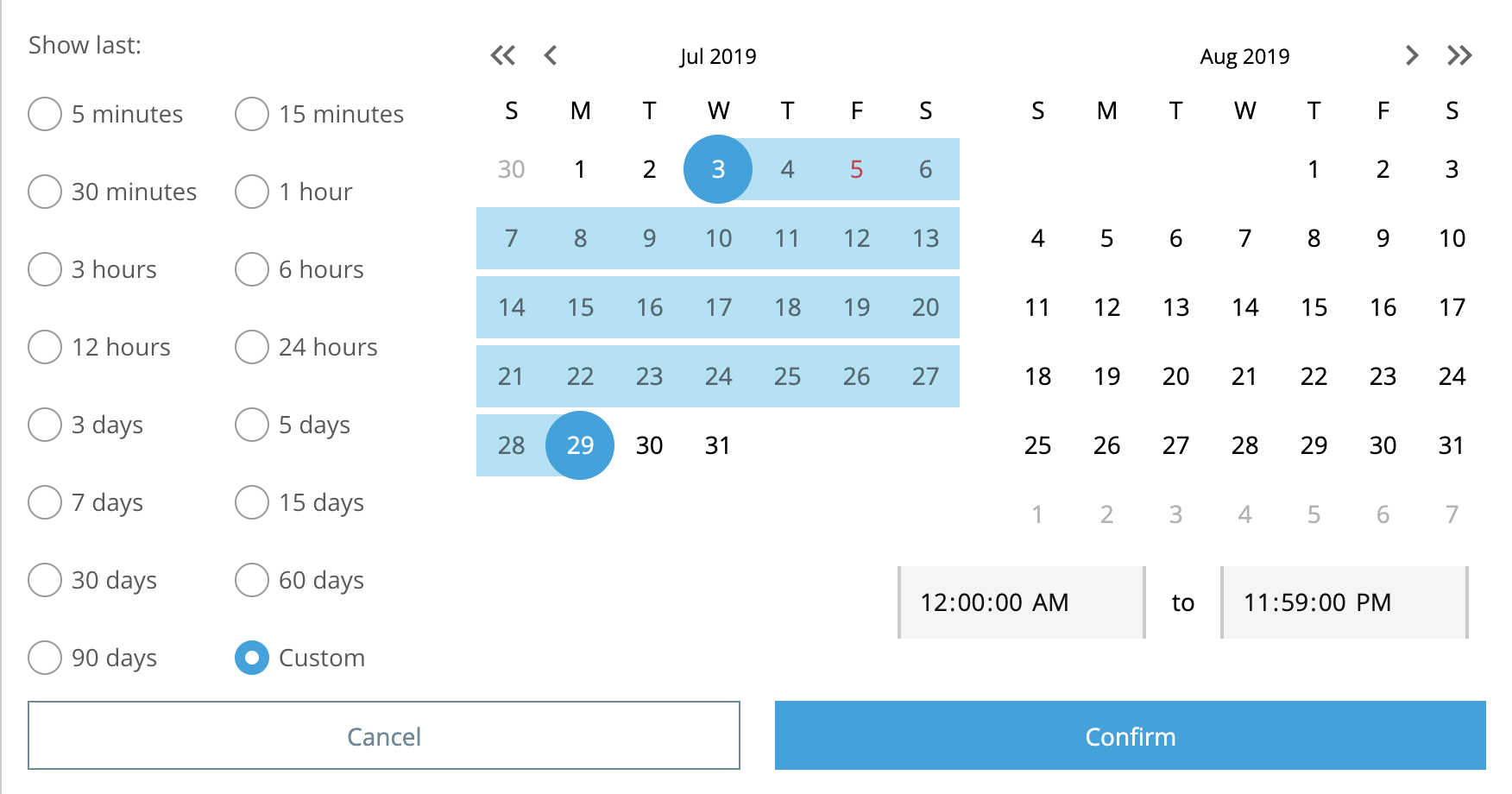
Custom settings are useful for isolating data over a given date and time range:
Changing the Time Period to Display
You can display an earlier or later time period in your chart, and you can zoom in or out to cover a shorter or longer period of time.
|
To display earlier or later data, you can use the less-than (<) and greater-than (>) icons. To zoom out and display data over a longer time period, you use the magnifying glass icon located between the less-than and greater-than icons |

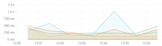
When you need to zoom in on activity that takes place at a specific time period, you use your mouse to narrow the time periods.
For example, if you are currently looking at a graph that shows data for the last 30 minutes, you can narrow the range to expose more detailed data points for the time period that concerns you.
Refreshing Data
If your pricing plan permits, you can refresh data automatically.
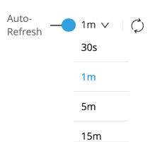
You can enable Auto Refresh, then set an interval at which to refresh data in the graphs (such as 1m, 5m, 15m, and so on). The refresh setting applies to all graphs in the dashboard include::reuse::partial$billing/pricing.adoc[tag=availabilityParenthetical].
You can also manually refresh data in the graph by clicking the circular (cycle) icon.
Viewing Selected Series Data in a Graph
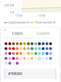
You can click aliases for data (such as Used:worker-0, Total:worker-0,Average:worker-0) in your graphs display or hide it. For an example of an alias, see the worker-0 alias in the color picker example.
To select or deselect two or more alias, you can use Command+Click.
Picking a New Color for Data Displays
Click the color bar in a legend (for example, the yellow bar by Total worker-0) to open a color picker to select a different color for the lines that connect your data points.
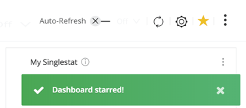
Set Favorite Custom Dashboards
Click the star in the custom dashboard to mark it as a favorite.
The star appears in the custom dashboard list, for example:
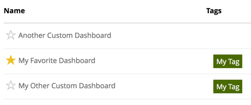
You can also configure tags for custom dashboards. See Configuring Custom Dashboards.