Reviewing Mule API Analytics Usage
You can view your Mule API Analytics data from both API Manager and Anypoint Monitoring. API Manager retains the Mule API Analytics data for up to 30 days. However, Anypoint Monitoring provides more robust API usage data with a retention period of 30 days.
To view Mule API Analytics Data in API Manager:
-
Navigate to Anypoint Platform > API Manager.
-
Click Mule API Analytics.
From the dashboard, you can navigate to the analytics about your APIs gathered by Anypoint Platform.
For more information about how you can view your data in Anypoint Monitoring, see Anypoint Monitoring API Analytics Dashboard.
When you access the analytics for your Mule APIs, by default you land on your Overview Dashboard that displays these charts:
-
Requests by Date: Line chart that shows the number of requests for all APIs in your organization.
-
Requests by Location: Map chart that shows the number of requests for each country of origin.
-
Requests by Application: Bar chart that shows the number of requests from each of the top five registered applications.
-
Requests by Platform: Ring chart that shows the number of requests broken down by platform.
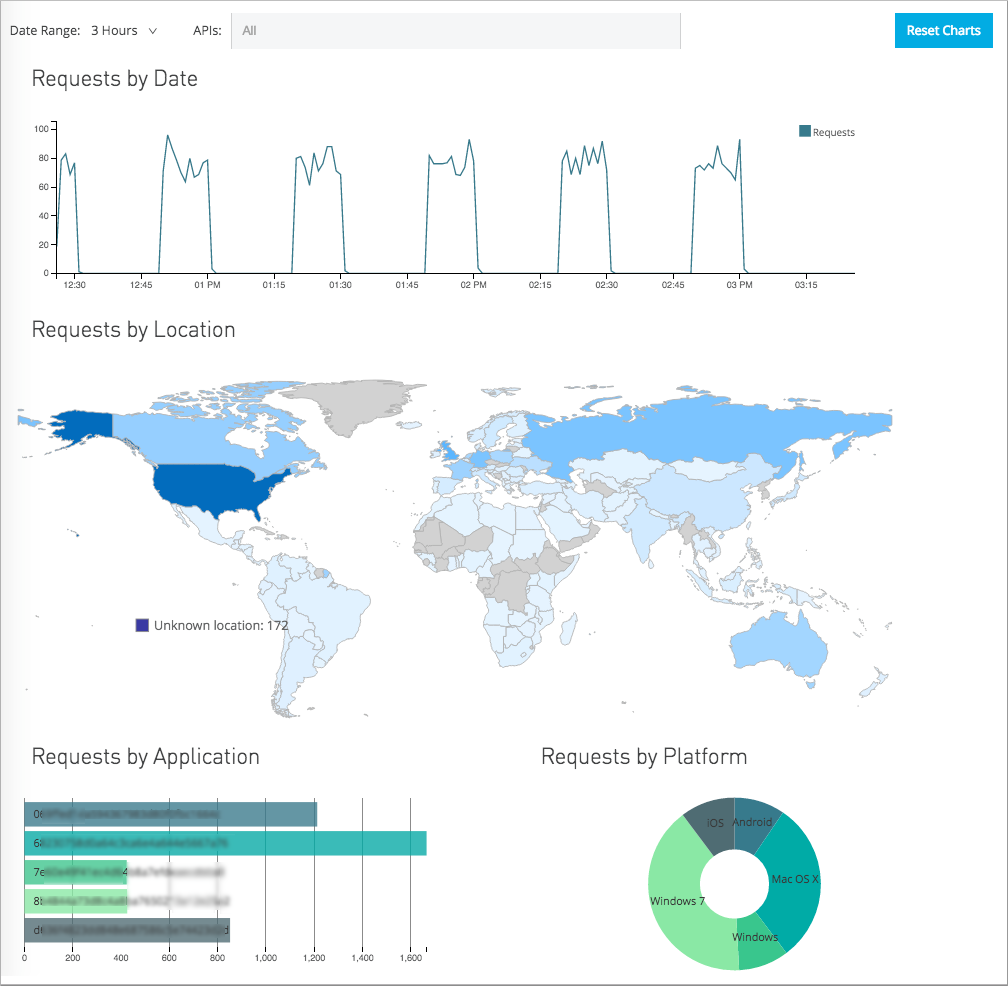
By default, these charts display the data for APIs in your organization for the past day. You can use the filters at the top left of the page to change the date range or filter to particular APIs. The time ranges reflect your local time zone.
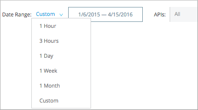
When selecting a custom time interval, the numbers of request of your requests by day line chart are not normalized. For example, monthly chart will show number of requests per 4 hours. For two months, the same chart shows requests per 8 hours. If you are using a line chart in a custom dashboard and need to define a custom interval, you need to explicitly set an aggregation interval.
All of the charts on the Overview Dashboard are cross-filtered. If you filter the data on any one of these charts, the same filter is applied to the other charts on the page. Clicking an individual application in the bar chart, for example, displays all of the requests from that application and the locations for those requests on the map. Here’s how to filter data on individual charts.
| Chart | How to filter data | How to clear your filter |
|---|---|---|
Requests by Date |
Click and drag an area of the chart to filter to just that time period. Once you have the slider filter applied, you can drag the ends to adjust them as needed. |
Click outside the area of the filtered portion. |
Requests by Location |
Click one or more countries to filter to just those results. Hover over a country for a tooltip displaying the name of the country and the total number of API requests received from that country for the selected time period. |
Click the country or countries again to reset the map. |
Requests by Application |
Click one or more application bars to filter to just those results. Hover over an application’s data bar for a tooltip displaying the name of the application and the total number of requests from that application for that time period. |
Click the application(s) again to reset the chart. |
Requests by Platform |
Click one or more segments to filter to just those results. Hover over a segment for a tooltip displaying the name of the application and the total number of requests from that application for that time period. |
Click the segment(s) again to reset the chart. |
To export the data for any of these charts, click the Export icon ( ).
).
If you have filtered data on one of the charts to show only selected data, the export icon triggers an export of a .csv file of the full data for that chart, filtered by whatever date range and API selection you have made using the filters in the upper left of the page. Exported files are limited to a maximum of 1 million records.
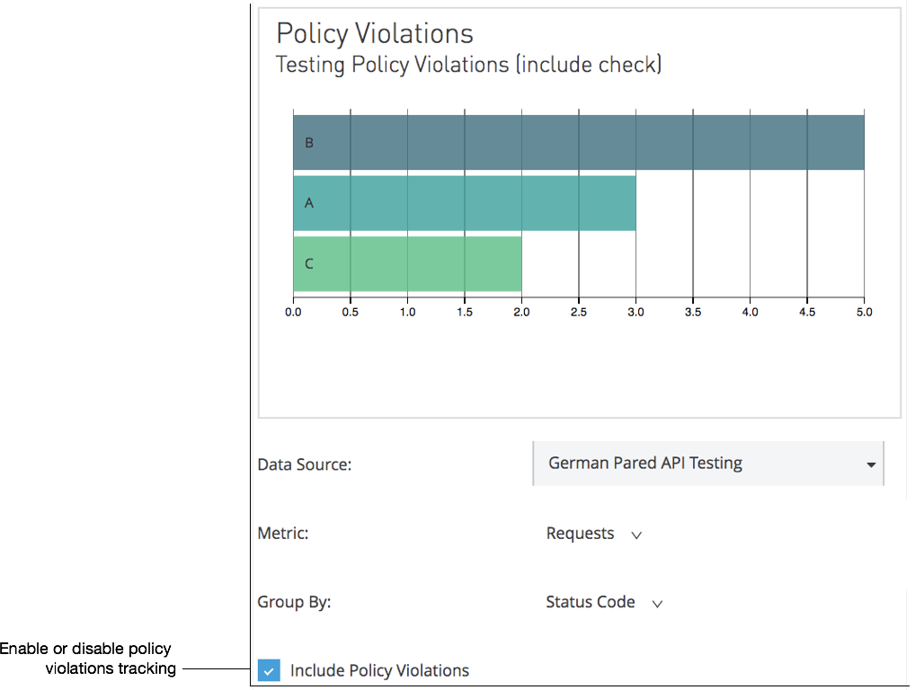
Including Policy Violations on the Dashboard
Note: Users must have the View Policies permission set to view policies or edit a Policy Violation alert.
For more information, see Setting permissions.
Enable or disable the tracking of policy violations by checking the Include Policy Violations checkbox on the dashboard. The dashboard will show traffic rejected, or not rejected, by a policy.
Creating Custom Charts
You can create a wide variety of custom charts to display specific data on your custom dashboard.
For example, you can create custom charts that show:
-
Hourly transactions per second between first day of the month and today, filtered by client ID, API version, or SLA tier.
-
Per minute latency average in the last 24 hours, filtered by API or grouped by client geolocation.
-
Number of policy violations grouped per subscribed application, per violated policy name
Only charts that group by Violated Policy Name include events that triggered a policy violation. All other charts exclude these events. For example, an API gets 100 requests, 90 succeed, and 10 are rejected by the rate-limiting policy. Charts that do not group by Violated Policy Name compute aggregates based on only the 90 requests that were not rate limited. Charts that group by Violated Policy Name, however, include all 100 requests in their computations.
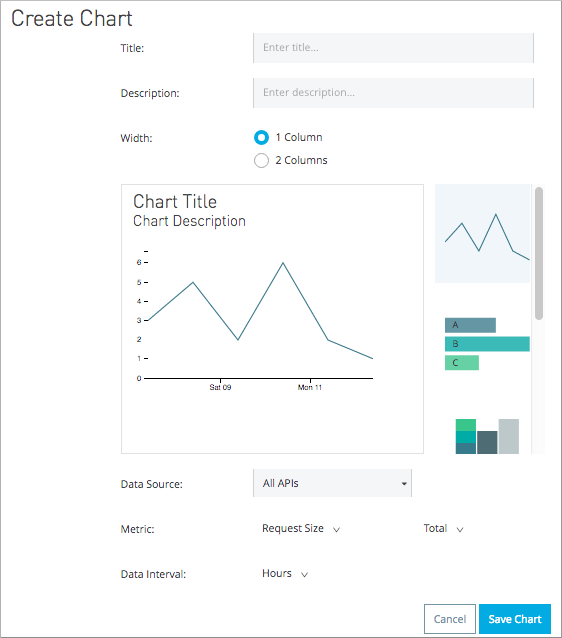
To create a custom chart, click Manage Charts:
-
Navigate to API Manager > Mule API Analytics > Manage Charts and click New.
Create Chart appears.
-
Fill in a Title, and, optionally, a Description.
-
Click a chart type graphic:
Icon Chart Type Chart Options 
Line chart
Data Source, Metric: metrics and Total, Data Interval: durations
Bar chart
Data Source, Metric: metrics and Total, Group By: categories

Stack chart
Data Source, Metric: metrics and Total, Group By: categories, Then By: categories
Ring chart
Data Source, Metric: metrics and Total, Group By: categories
Map chart
Data Source, Metric: metrics and Total
-
Select a Data Source value:
-
All APIs in your organization
-
A specific API
-
-
Select from one of the Metrics metrics value and a Total:
-
Request Size (in bytes)
-
Requests
-
Response Size (in bytes)
-
Response Time (in milliseconds)
-
-
For a Line Chart, select a Data Interval durations value:
-
Minutes
-
Hours
-
Days
-
-
For a Bar Chart or Stack Chart, select a category for Group By, and if your chart supports it, a category for Then By:
-
API Name
-
API Version
-
Application
-
Browser
-
City
-
Client IP
-
Continent
-
Country
-
Hardware Platform
-
OS Family
-
OS Major Version
-
OS Minor Version
-
OS Version
-
Postal Code
-
Resource Path
-
Status Code
-
Timezone
-
User Agent Type
-
User Agent Version
-
Verb
-
Violated Policy Name
For Stack chart, you can group your data in two different dimensions. The first defines the distinct columns, the second defines the stacks within these columns. The same options are available on the second grouping dimension as on the first.
-
-
Save the chart.
The custom chart appears.
Example Custom Chart: Policy Violations Per Application
-
Navigate to API Manager > Mule API Analytics > Manage Charts and click New.
-
In Title, type Policy Violations Per Application.
-
In Description, type Number of violations per subscribed application
-
Select a stack chart.
-
In Data Source and Metric, accept the default values.
-
Select two levels of grouping for the stack chart:
-
Select Application to display each application in a different column.
-
Select Violated Policy Name as the stack within each column.
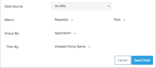
-
-
Save the chart.
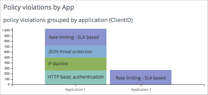
The chart appears:
Creating a Custom Dashboard
After you create custom charts, you can display them side by side on a custom dashboard that is unique to you.
To access your custom dashboard, click the Custom Dashboard. The first time you open your custom dashboard, it is blank.
-
Navigate to API Manager > Mule API Analytics > Custom Dashboard and click Edit Dashboard.
-
Assuming you created custom charts, drag and drop charts from the drawer on the left of the screen onto your dashboard, rearranging them as needed into the order that you want.
-
After you add a chart to your dashboard, you have the option to open it for editing or click the X to remove it from your dashboard.
-
When you are satisfied with your custom dashboard, save it.
The custom dashboard appears.
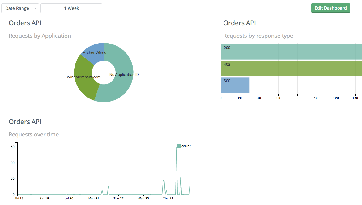
Use the date range picker to adjust the time period for all the charts on your dashboard.
Exporting Analytics Data
You can export your analytics data from the charts displayed on your Overview Dashboard or your Custom Dashboard. On either dashboard, click the Export icon () to download a CSV file with the data for that chart.
The data you download reflects filtering options you selected. However, if you are exporting chart data from the Overview Dashboard and you have selected one or more subsections of a chart, the exported files do not include filtering options. Exported files contain the full data for that chart.