Configuring Graphs in a Custom Dashboard
Configure metrics data in a graph. A custom dashboard graph in Anypoint Monitoring displays metrics for a Mule app or API.
Advanced options support fine-tuned configurations and multiple metrics in a single graph. You can also customize axes, the look of the graph, legends, and behavior of the graph when you hover over a data point.
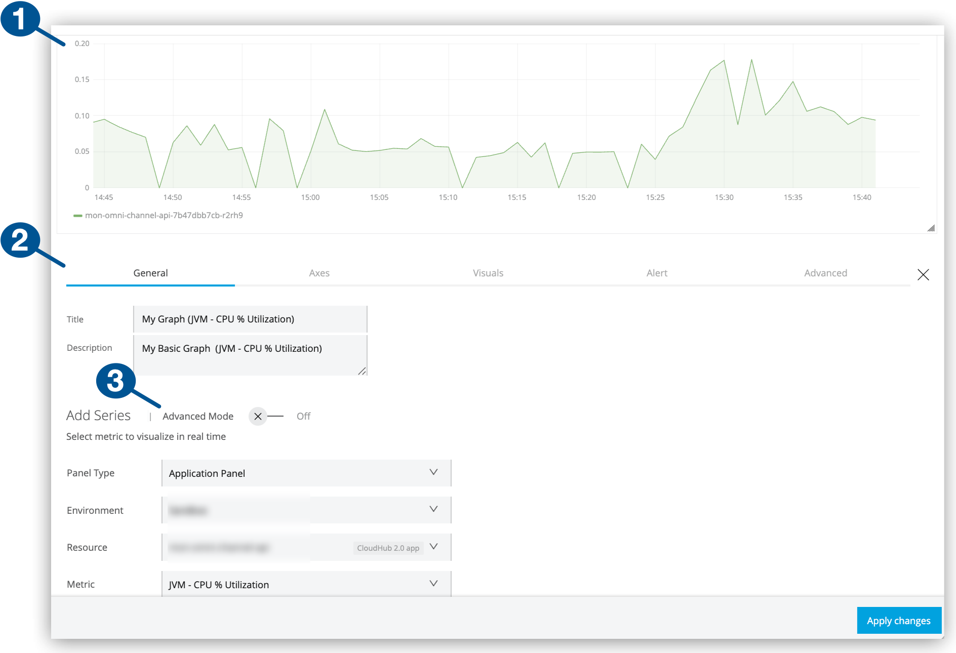
| 1 | Graph example (basic mode) |
| 2 | Graph configuration tabs:
|
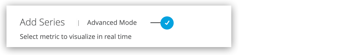
| 3 | Advanced Mode: Switch for enabling advanced configurations
Advanced mode supports complex configurations with up to 25 queries. |
Create a Graph
Create a graph in a custom dashboard by following the guidance in Add Charts to a Custom Dashboard.
Configure a Graph
Configure a graph in a custom dashboard.
-
From Custom Dashboards, open the custom dashboard that contains your graph.
For guidance, see View a Custom Dashboard.
-
Click the graph’s
 (More menu), and select Configure.
 -
Click the graph’s General configuration tab.
-
Provide a title and description.
-
Select and configure a graph mode (basic or advanced).
For more information, see General Settings for Basic and Advanced Queries.
-
-
In the graph’s Axes tab, set the graph’s axes or use the defaults.
For more information, see Axes (X-Axis and Y-Axis Settings).
-
In the graph’s Visuals tab, set bars, lines, or points for the graph.
-
Optionally:
-
In the Alert tab, configure an alert and email notification.
Alerting isn’t available in advanced mode.
-
In the Advanced tab, provide advanced configurations.
-
-
Click Apply Changes.
-
Exit the configuration view by clicking the X next to the configuration tabs.
General Settings for Basic and Advanced Queries
General tab settings include basic and advanced modes (or queries) for configuring time-series data. Both configurations share fields for the title and a short description.
| Basic and Advanced Mode Settings | |
|---|---|
Title |
Title to display in the UI. Defaults to Panel Title. |
Description |
Short description to display in the UI when users hover over the information ( |
Other settings are specific to the setting mode (basic or advanced).
Basic Mode
In the General configuration tab, a basic query selects a single metric for a deployed Mule app or API in a given environment.
| Basic Mode Settings | |
|---|---|
Panel Type |
From the drop-down menu, select the type of panel to display for the resource (Application Panel or API Panel) |
Metric |
The drop-down menu includes these types of metrics:
For a list of basic metrics, see Basic Mode Metrics |
Environment |
The environment where your application or API is deployed. |
Resource |
A deployed application. This option is available if you select Application Panel as your panel type. |
API |
A deployed API. This option is available if you select API Panel as your panel type. |
Version / Instance |
The Mule version or instance on which your API is deployed. This option is available if you select API Panel as your panel type. |
| When you create an application panel using a JVM metric, the query that supports the panel uses only the worker-id for the app. When you modify the panel at a later time, the resource fields are populated with the query content. Because some apps share a worker-id, the resource that appears in the selector might appear to be a different resource from the resource you selected originally. However, all resources share the same worker, so the query has the correct information despite the selector displaying a different resource name. |
Advanced Mode
In the General configuration tab, advanced mode settings support fine-tuned queries for metrics.
| If you switch back to basic mode, some advanced configuration queries are removed. |
| Advanced Mode Settings for Applications | |
|---|---|
From |
Lists metrics, such as This field provides matching suggestions when you type in a character. For example, For a list of advanced metrics, see Advanced Mode Metrics |
Where |
Supports conditional logic for filtering the From metric you selected.
Grouping |
Select |
Add one or more metric |
Group By |
For grouping the data by a selected time interval (such as Valid values and arguments:
|
Alias By |
You can create a label for your metric using a literal string (such as |
| Advanced Mode Settings for APIs | |
|---|---|
From |
Lists metrics, such as For a list of advanced metrics, see Advanced Mode Metrics |
Where |
Provides conditional logic for filtering the metric selected from the From field. You can select one or more filter tags (such as |
Select |
For creating a function that selects a metric field (such as |
Group by |
For grouping the data by a selected time interval (such as
|
Alias by |
You can create a label for your metric using a literal string (such as To use your tag as an alias, the tag must be included in the |
Axes (X-Axis and Y-Axis Settings)
Configure the x-axis and y-axis of your graph in the Axes tab.
Y-Axis Settings
Set a vertical y-axis for the left (Left Y) or right (Right Y) side of your graph.
| Y-Axis Settings | |
|---|---|
Show |
If unchecked, hides the y-axis from the graph. |
Unit |
The unit of measurement to use for values on the y-axis. Values include |
Scale |
Valid values for a linear or logarithmic (log) scale for coordinates on the y-axis:
|
Y-Min |
The minimum value for a y-coordinate. Defaults to |
Y-Max |
The maximum value for a y-coordinate. Defaults to |
Decimals |
Overrides the automatic decimal precision on y-coordinates, for example, where |
Label |
A string used to label the Y axis. Defaults to |
X-Axis Settings
| X-Axis Settings | |
|---|---|
Show |
If unchecked, hides the x-axis from the graph. |
Mode |
Valid values:
|
Value |
Visible only if Series mode is selected. |
Buckets |
Visible only if Histogram mode is selected. Divides the range of values for a given metric into the specified number of intervals so that the histogram can display the count or frequency of data points that fall into that interval. |
After you complete your configuration, you can click Save Changes. To exit the configuration and return to the dashboard, simply click the X.
Visuals (Bar, Line, Data Point Settings)
You can configure the style and look of graph to use. Bar, line, and point graphs are supported.
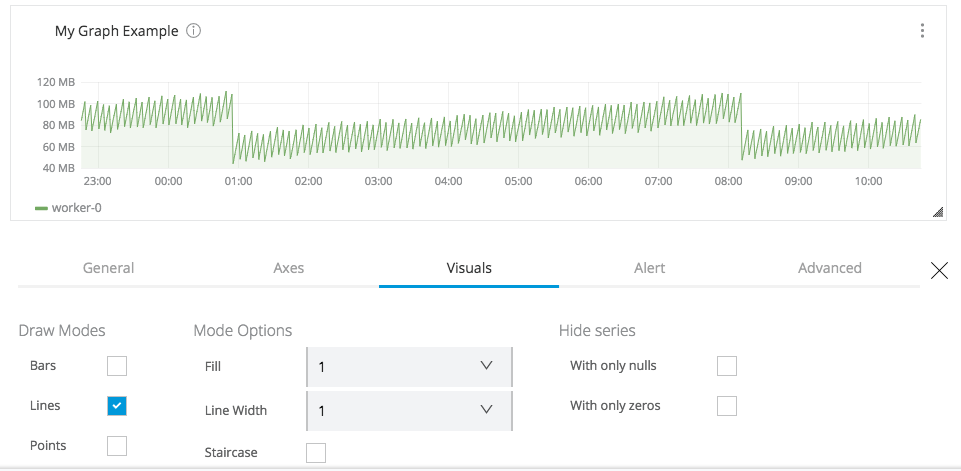
| Visual Configuration Options | |
|---|---|
Draw Modes |
You can check one or more of these modes:
|
Mode Options |
Only available when the selected Draw Modes are Lines or Points.
|
Hide Series |
|
Alerts (Configuration, Notifications, History)
|
From a graph’s Alerts tab, you can:
Configure an Alert
-
Navigate to the Alert configuration tab for a graph that is configured in basic mode.
-
Click Add Alert.
-
Use Alert Config to configure the alert.
Settings for Alerts in Custom Dashboards Name
A title for your alert
Severity level
The severity level of your alert.
Condition
WHEN: For triggering an alert if the metric rises above a specified level
-
Configure email notifications when an alert is triggered.
Notification Settings for Alerts Send To
Email address for each recipient of the alert notification. If you add or change the email address of an alert recipient, they don’t receive an email until the alert is triggered.
Message
Message to send to the recipient.
-
Click Save Changes.
-
Click X to exit the configuration and return to the dashboard.
Advanced (Legends, Thresholds, Stacking, Hovering, Time Shift Settings)
Add and configure legends, thresholds, and other features for your graph.
Legends (Advanced Setting)
In the Advanced configuration tab, configure legends for your graphs.
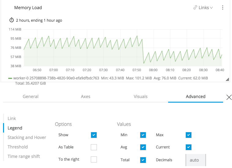
| Legend Options | |
|---|---|
Show |
Unchecking hides the legend. Checked by default. |
As Table |
Check to display the selected legend Values (such as |
To the Right |
Check to display the legend on the right side. Unchecked by default. |
Width |
Available when To the Right is checked. Sets the minimum width (in pixels) for the legend. Leave it blank to allow for automatic width selection. |
You can also display the following values in a legend:
| Legend Values | |
|---|---|
Min |
Minimum of all values returned from the query |
Max |
Maximum of all values returned from the query |
Avg |
Average of all values returned from the query |
Current |
Last value returned from the query |
Total |
Sum of all values returned from metric query |
Decimals |
Overrides automatic decimal precision used in legends and tooltips |
After you complete your configuration, click Save Changes.
To exit the configuration and return to the dashboard, click the X.
Stacking and Hover (Advanced Setting)
In the Advanced configuration tab, you can configure a hover tooltip to display information about a data point in a graph when you hover over the value.
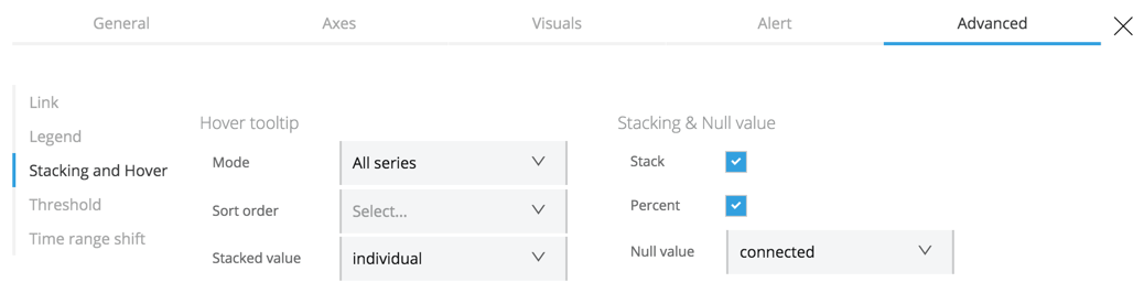
| Hover Tooltip Settings | |
|---|---|
Mode |
To display one or all series in the tooltip. |
Sort Order |
Displays data in no order (None), Decreasing, or Increasing order. Defaults to None. |
Stacked Value |
Available when Stack is checked. Controls the display of values in the tooltip. Valid values are:
|
Stacking and Null functionality displays multiple series as a group within a stack. You can also specify how to deal with null values.
| Stacking and Null Settings | |
|---|---|
Stack |
When checked, stacks each series, one on top of another, instead of overlaying them. |
Percent |
Available when Stack is checked. Displays each series of stacked values as a percentage. |
Null Value |
Determines how to display null values: Connected, Null, Null As Zero. |
Threshold (Advanced Setting)
In the Advanced configuration tab, you can set one or more thresholds, such as a line or section to a graph, to indicate whether the data crosses a limit that you specify.
| Thresholds are not available when an alert is in place on the graph. To re-enable thresholds for a chart, you must delete the alert. |
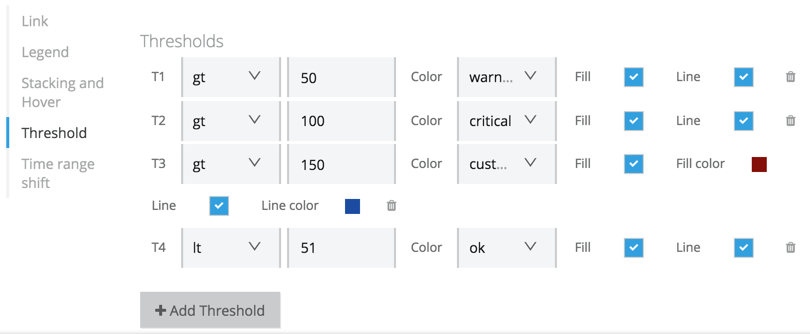
| Threshold Settings | |
|---|---|
gt or lt |
Indicates whether the limit applies to data that is greater than ( |
Threshold value |
A numeric value for the threshold. |
Threshold type |
Identifier for the threshold (Custom, Critical, Warning, or OK). |
Fill |
Adds a filler color to the graph that corresponds to the specified threshold setting. |
Line |
Adds a line to the graph that corresponds to the specified threshold setting. |
Fill Color |
Similar to Fill settings, but for custom thresholds only. |
Line Color |
Similar to Line settings, but for custom thresholds only. |
Time Range Shift (Advanced Setting)
In the Advanced configuration tab, you can override any time intervals or ranges that end users select for the custom dashboard. Such selections are global and apply to all charts in the dashboard. Overrides are useful when the selection does not make sense for a particular graph.
Time ranges are calculated backwards from the present time. For example, you might set the time range so you can view the last 2 hours of data in a graph. You can also shift the time range to calculate backwards from an earlier point in time, for example, from 1 hour ago instead of from the present time.
| Time Range Shift Settings | |
|---|---|
Override Relative Time |
The amount of time to show in the x-axis of the graph (for example, |
Add Time Shift |
Amount of time before now (the current time) to end (or shift back in time) the duration set by Override Relative Time. For example, if the time right now is 10:00, and you shift the time to |
Hide Time Override Info |
Checkbox for hiding the description of any Override Relative Time and Time Shift settings from the graph. |